Telstra Connect
A mobile-first redesign of Telstra Connect to deliver a unified, efficient experience for enterprise customers.
Telstra is Australia’s largest telecommunications company, providing services from mobile and broadband to enterprise solutions such as cloud computing, cybersecurity, and IT infrastructure. The brief was to redesign Telstra Connect, its enterprise platform, into a mobile-first v2.0 delivering a unified, information-rich view of customer operations.
Duration: 12 Weeks
Type: University Assignment
Scope: Research, ideation, user testing, and prototyping in Figma.
Phase 1 – Research & ideation
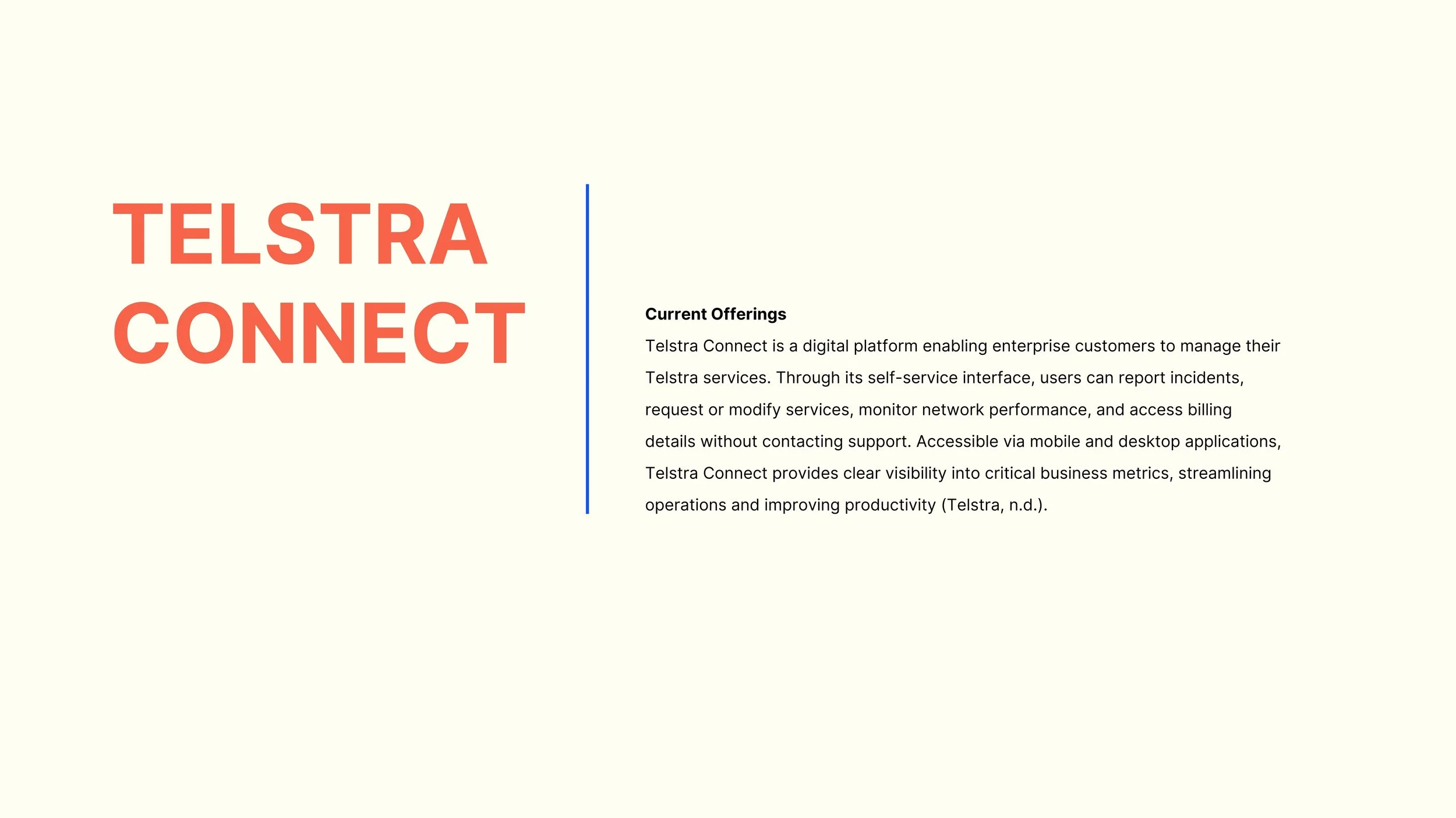
About Telstra Connect — Telstra’s platform for enterprise and business customers to manage their telecommunications operations.
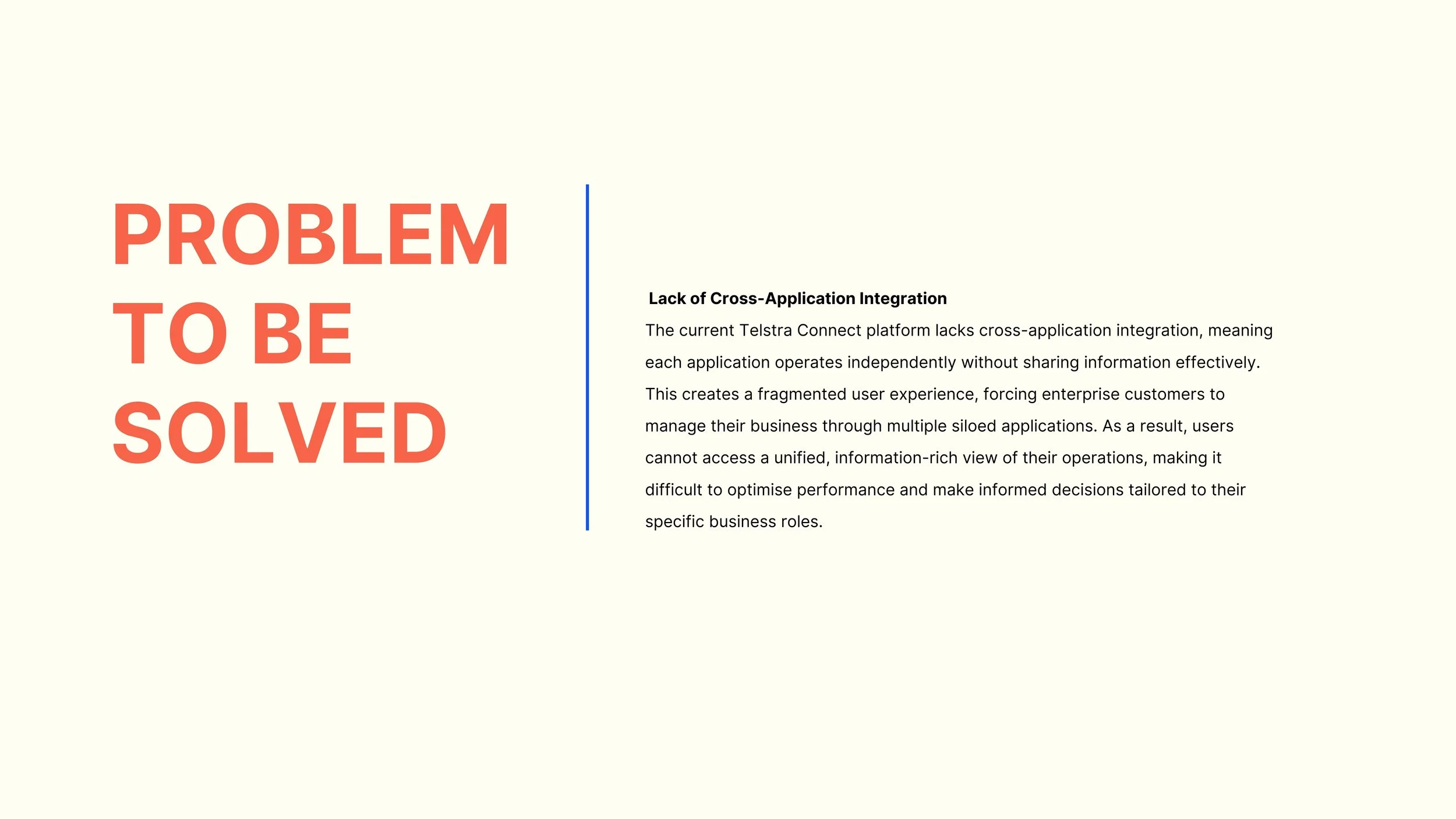
Problem definition — the current platform creates a fragmented and inefficient user experience for enterprise and business customers.
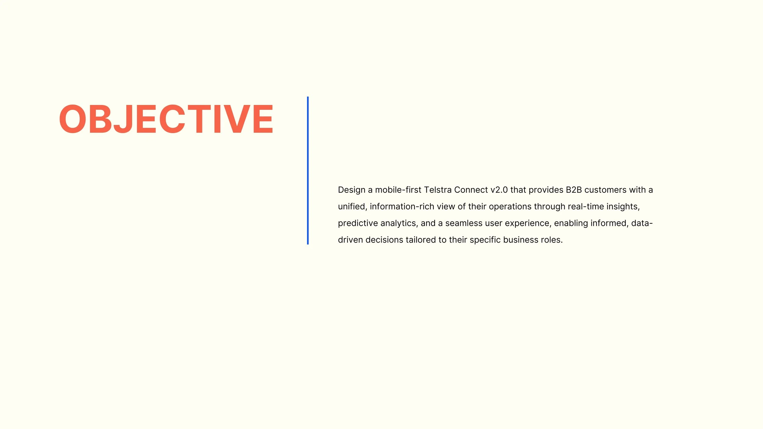
Objective — redesign Telstra Connect into a unified, easy-to-use mobile platform with a single, information-rich dashboard.
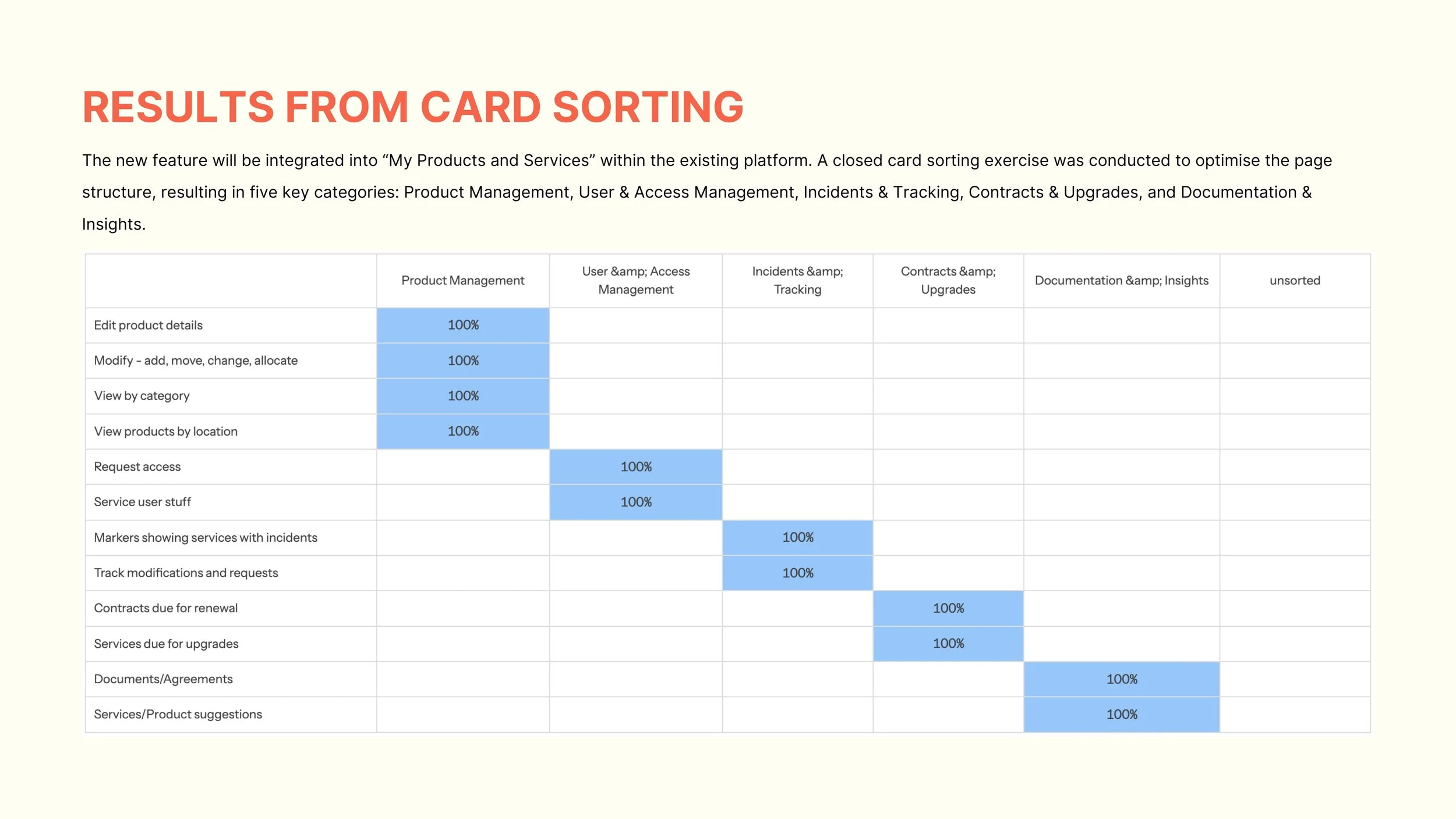
We were asked to choose one section of the app to focus on, and I selected My Products and Services. I conducted a closed card sorting exercise to determine what should appear in the menu of this section. The items on the left are content that had to be included, while the categories across the top are the groups I created to structure the content.
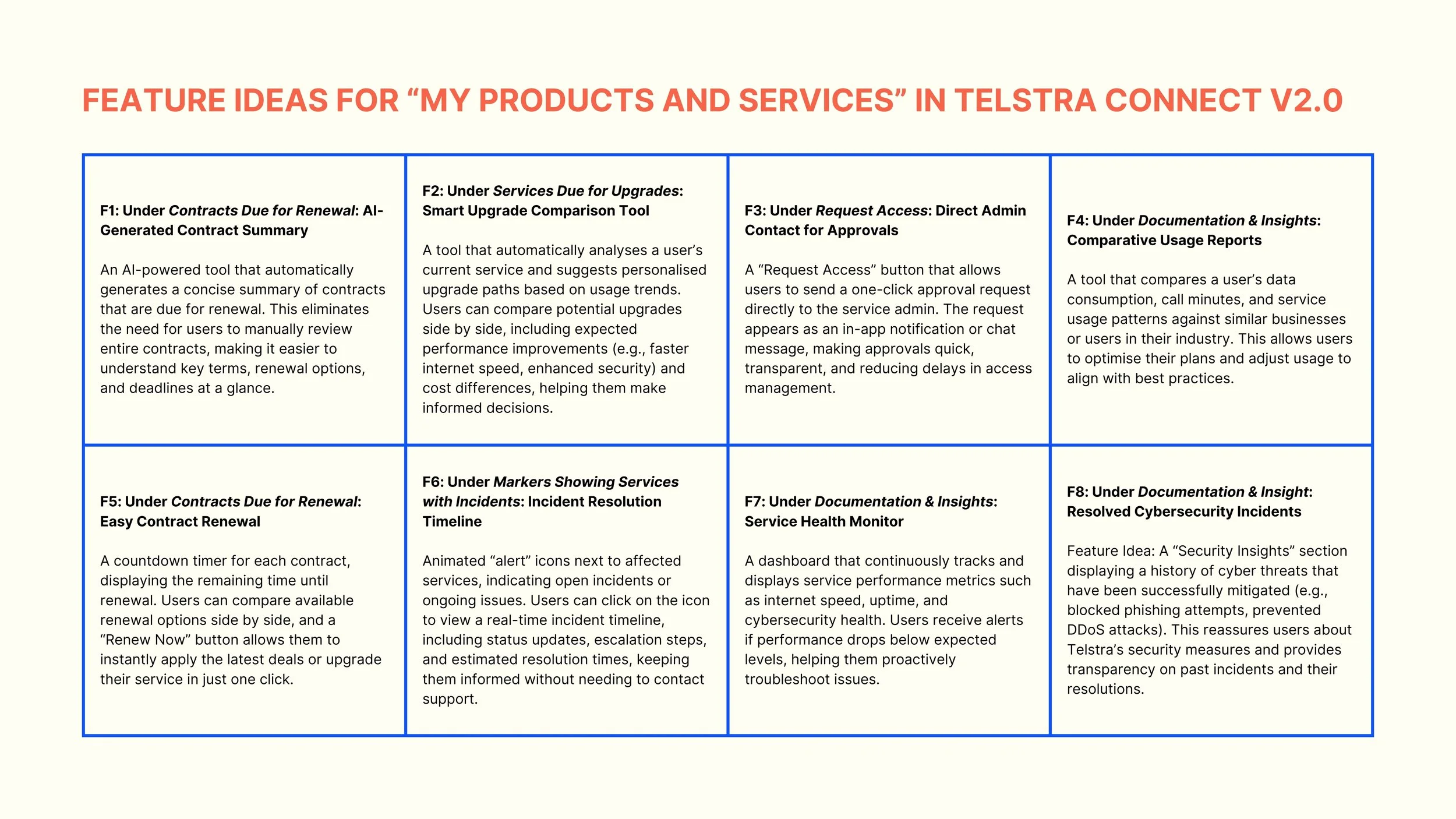
Next, I ideated potential features for the My Products and Services section in Telstra Connect v2.0.
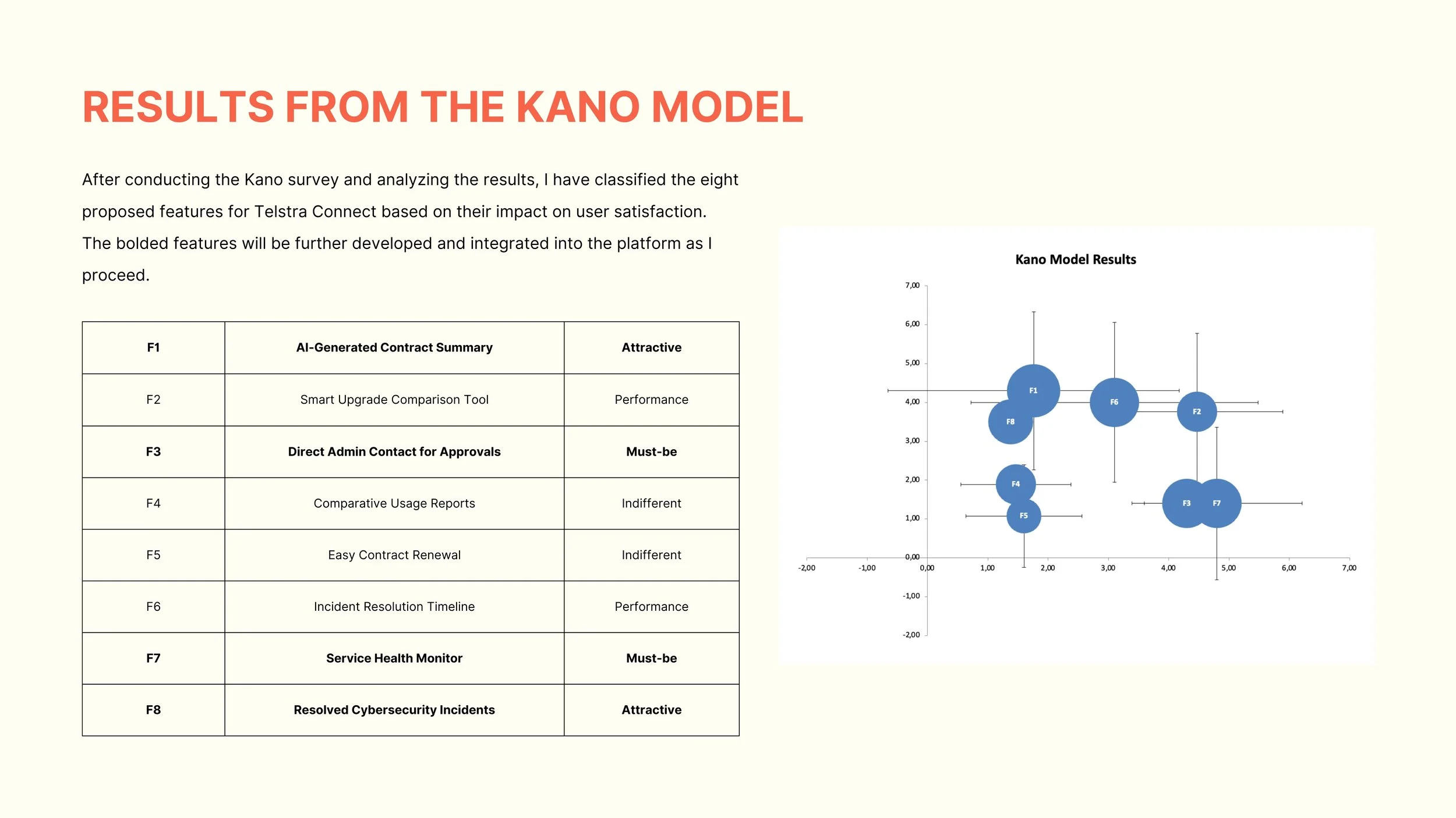
I then conducted a Kano survey to determine which features to prioritise, based on their impact on user satisfaction.
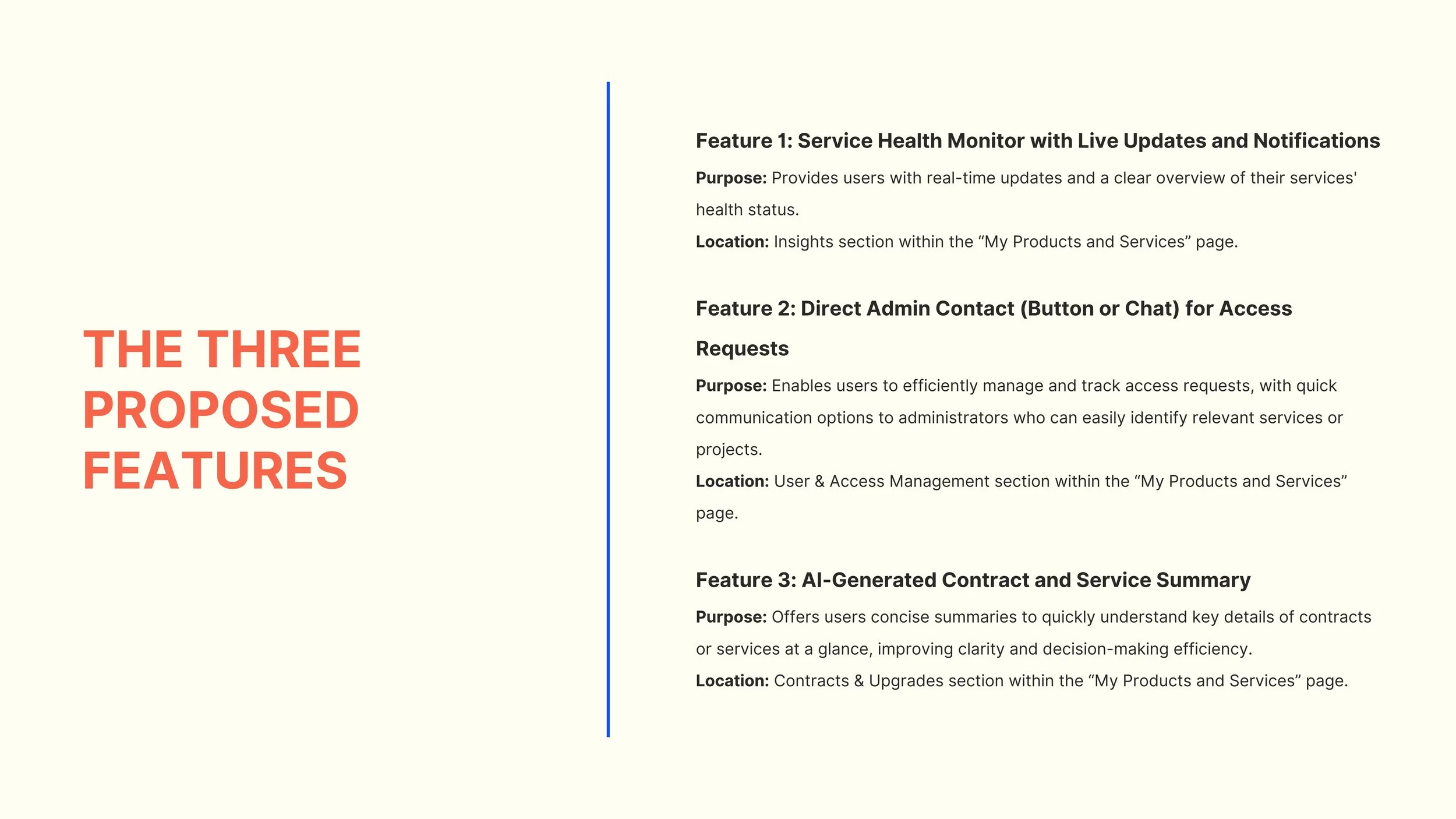
The three proposed features I selected for my My Products and Services prototype, based on the Kano Model and feedback.
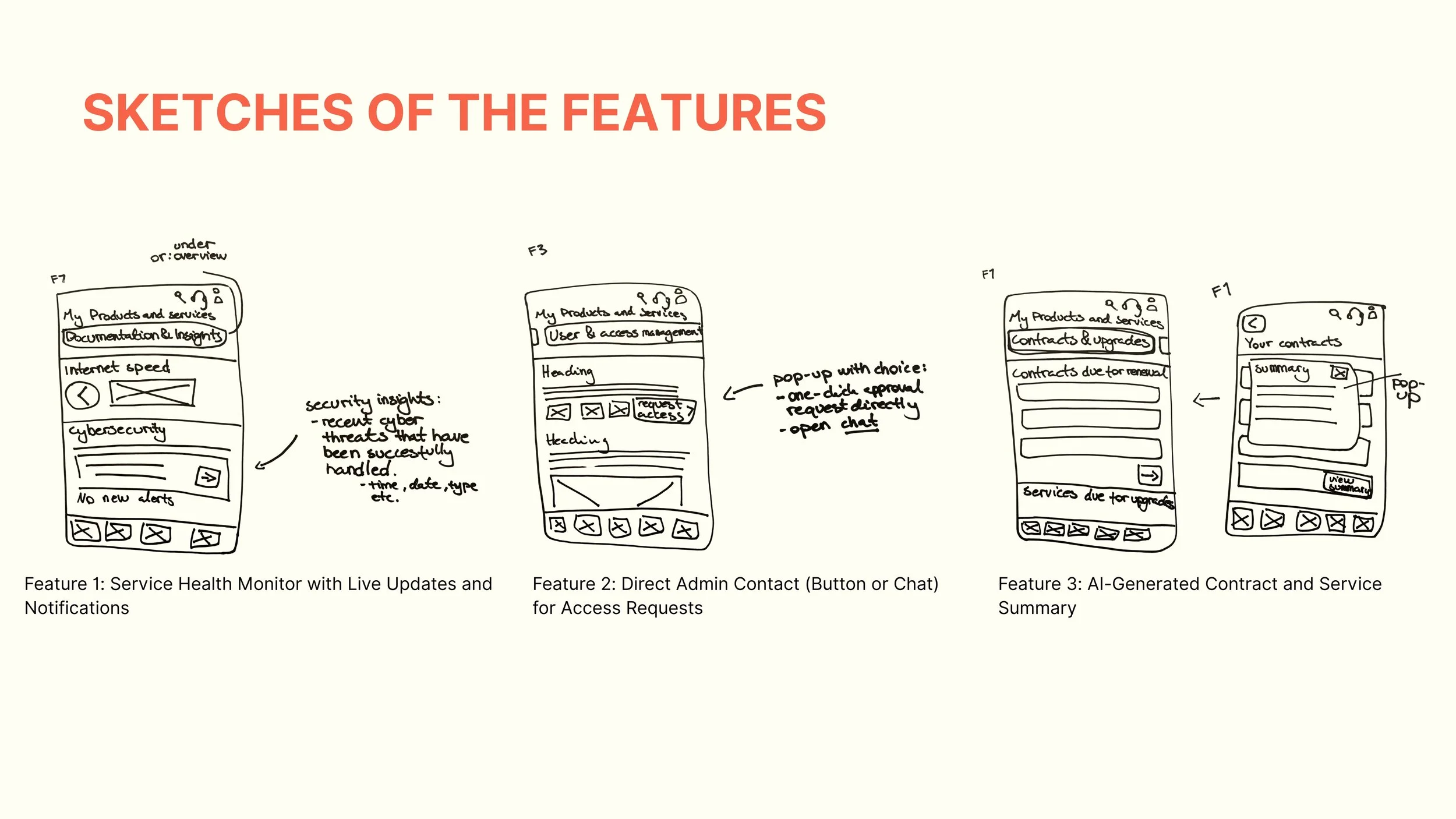
Initial sketches of my proposed features.
Phase 2 – Mid-Fidelity & User Testing
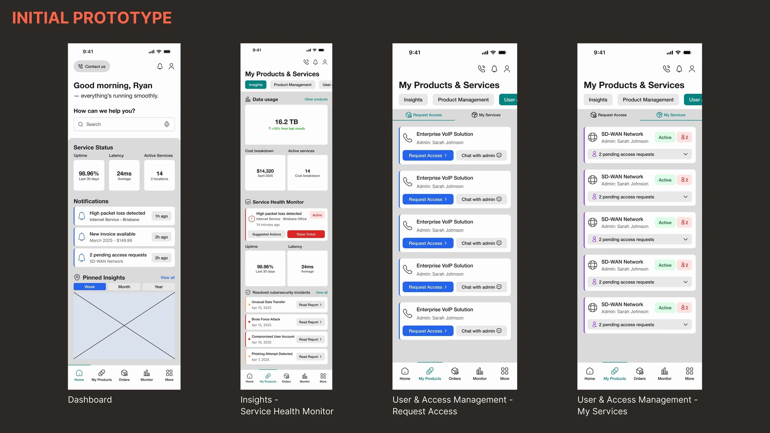
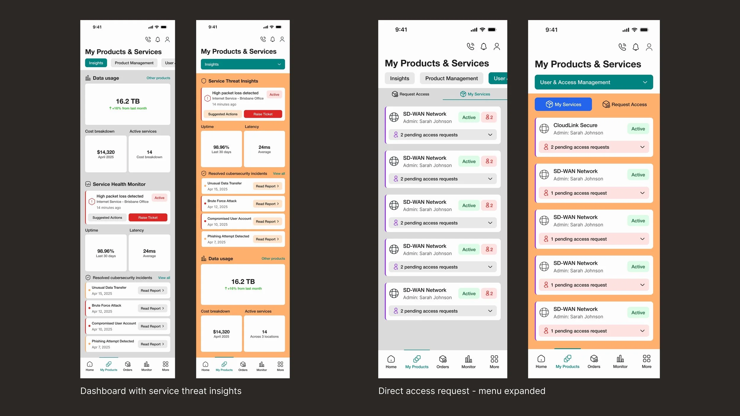
Mid-fidelity prototype. The horizontal scroll menu at the top displays the categories defined through closed card sorting. These frames show: - Feature 1: Service Health Monitor with Live Updates and Notifications - Feature 2: Direct Admin Contact (Button or Chat) for Access Requests
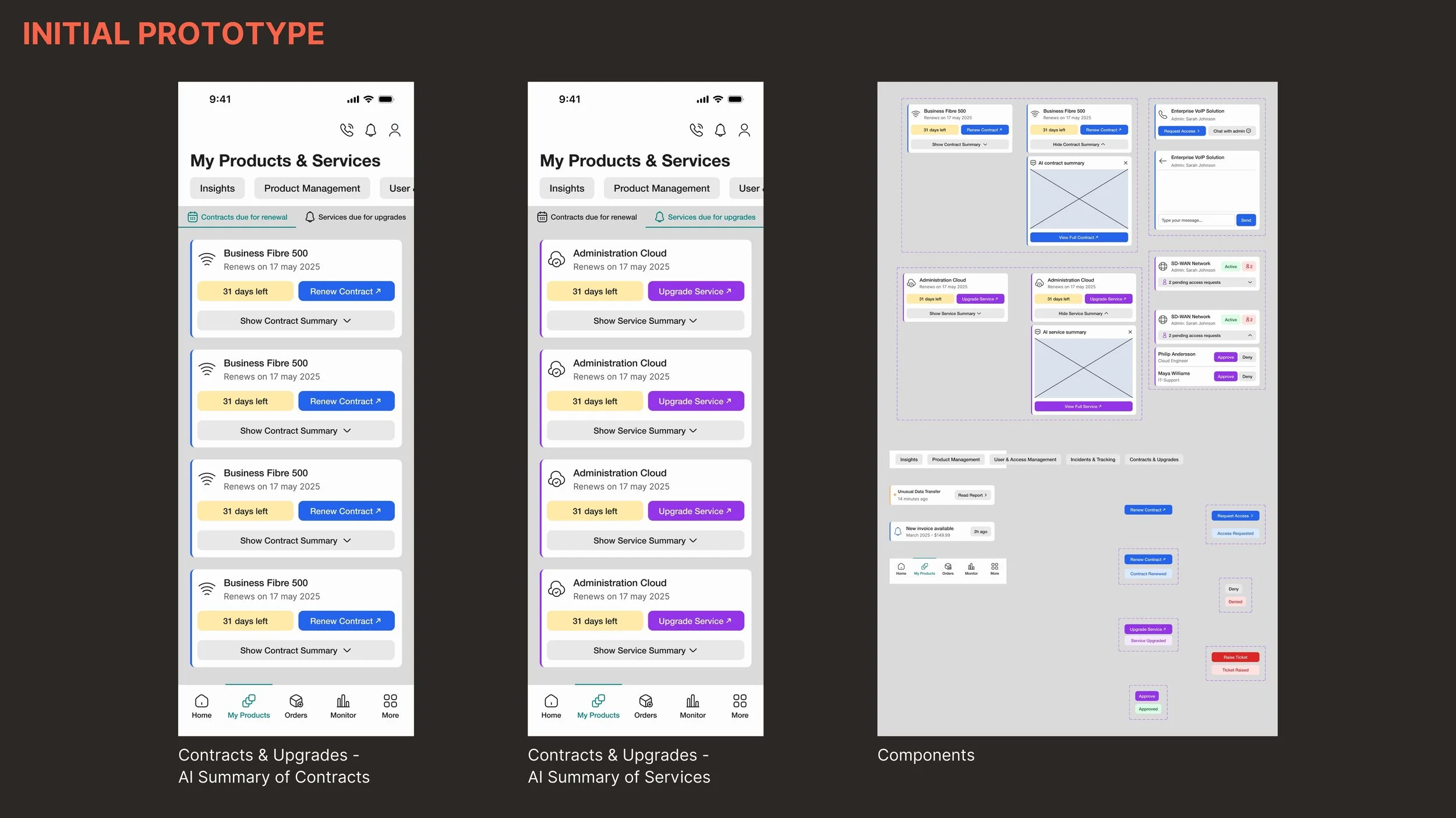
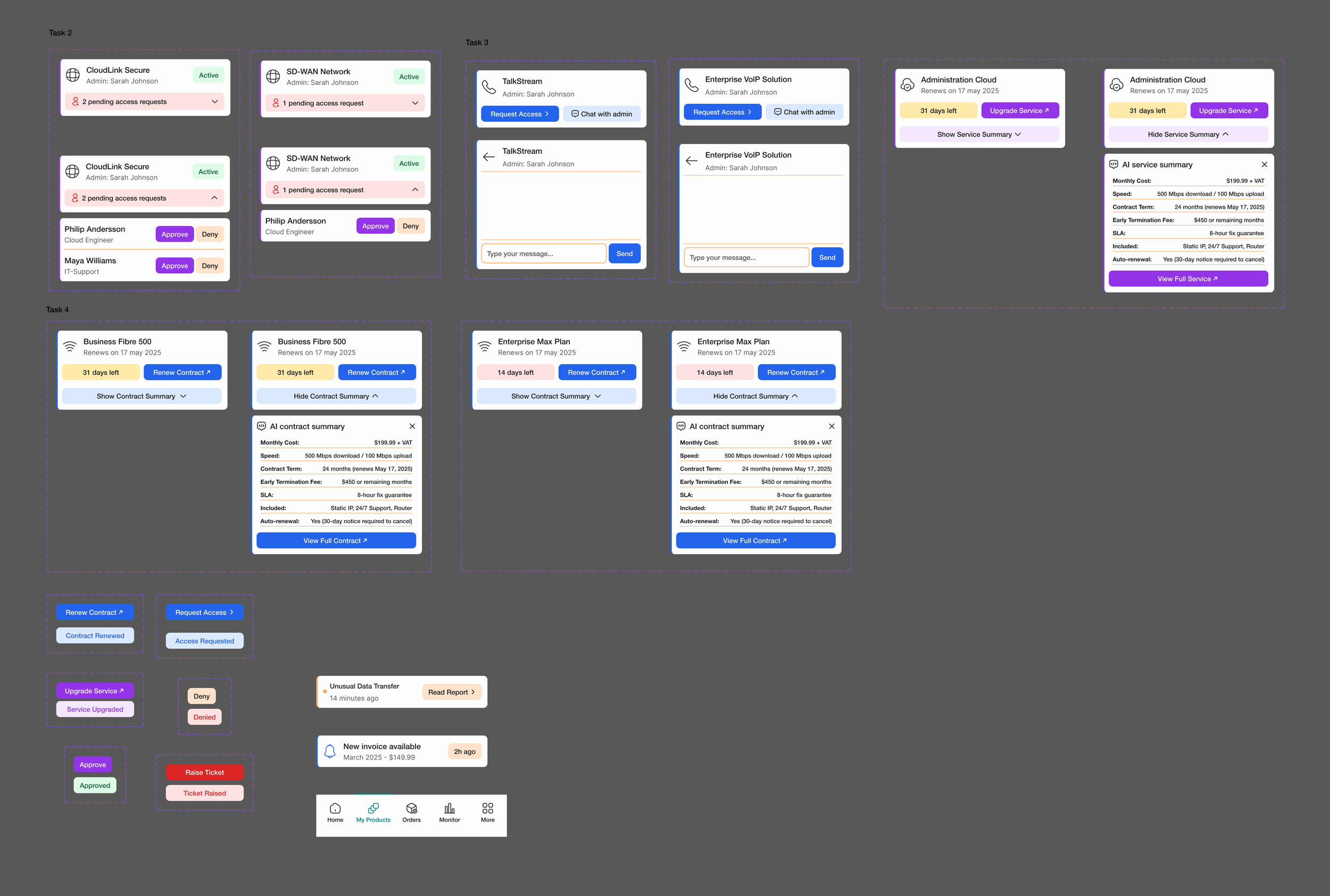
These frames show Feature 3: AI-Generated Contract and Service Summary. The frame on the right shows the components used.
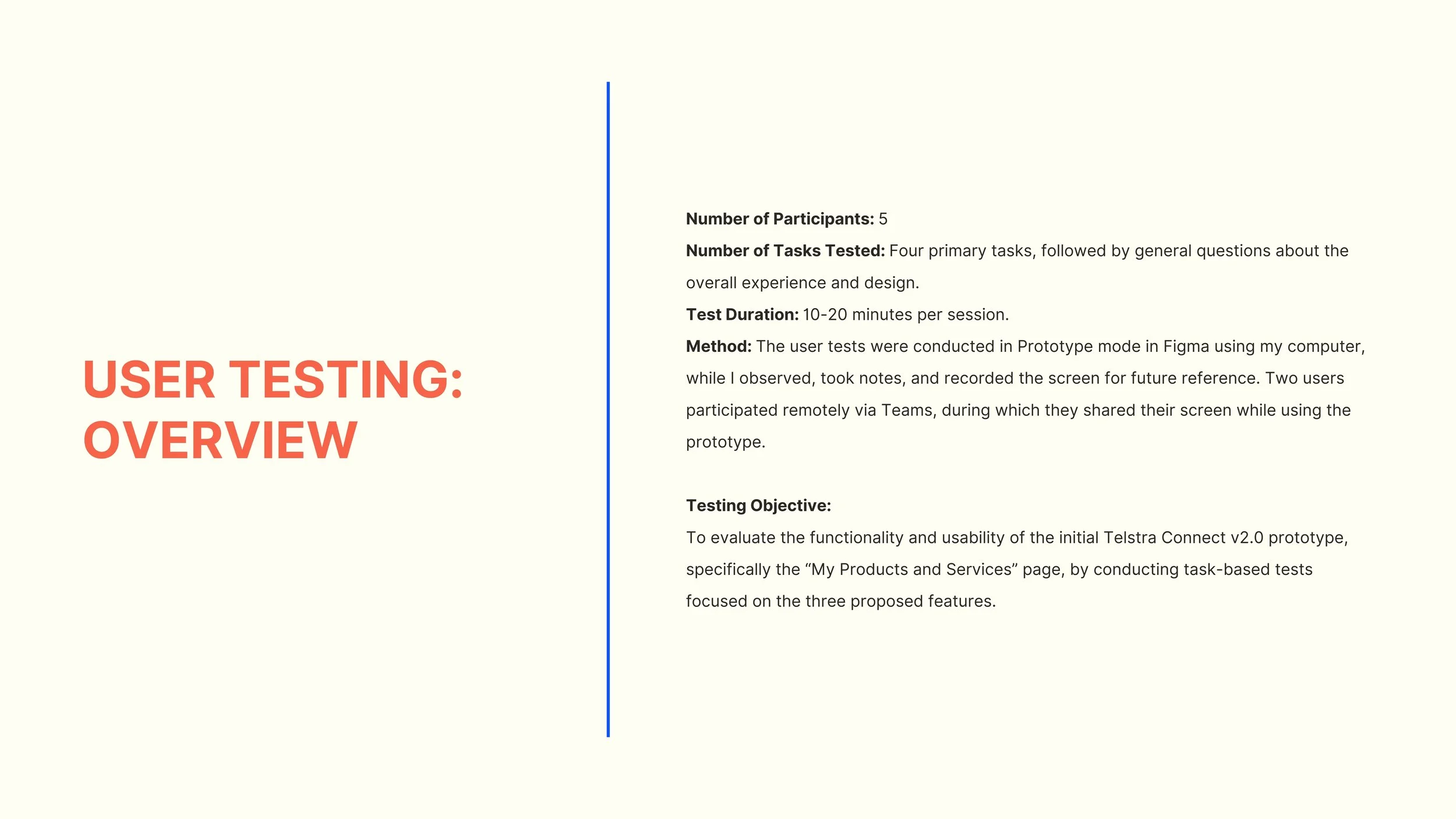
I then conducted a user test where participants completed tasks related to the features I designed.
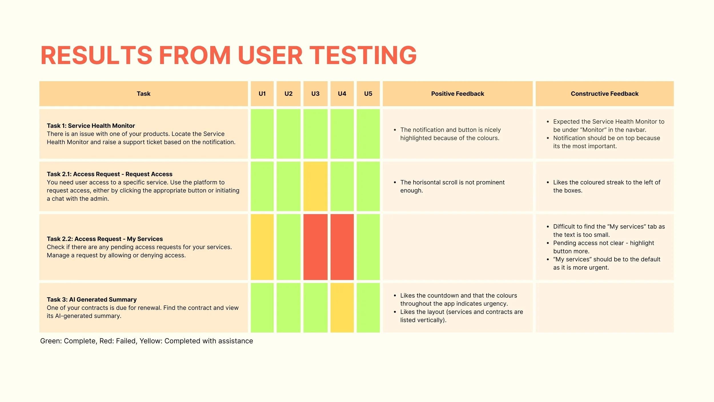
Findings from user testing: Feature 2 (direct admin contact via button or chat for access requests) required improvements.
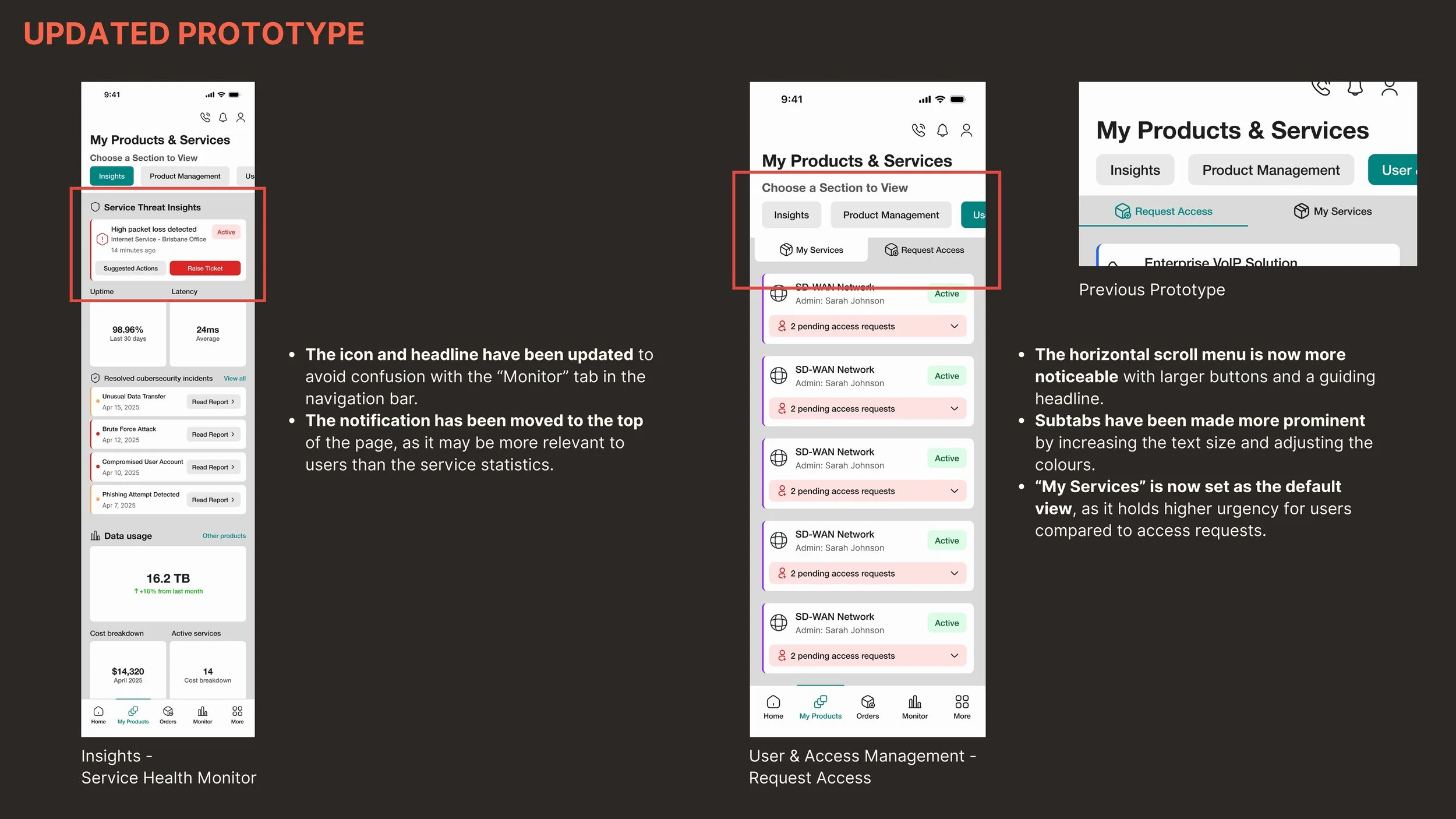
To address this pain point, I enhanced the visibility of the horizontal scroll menu and subtabs, as several participants had overlooked them during user testing.
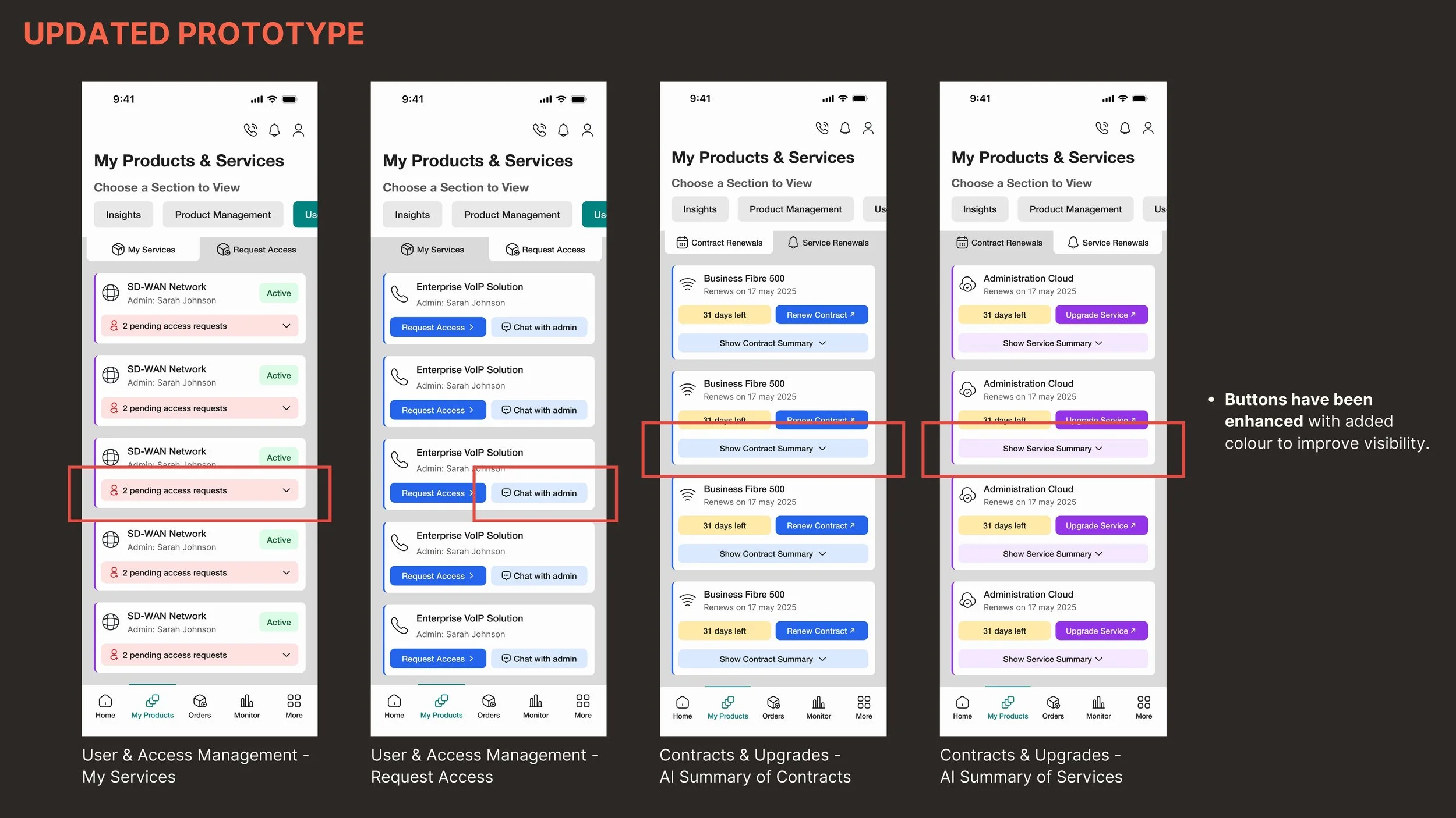
I also made buttons more prominent to improve visibility.
Phase 3 – A/B Testing and High-Fidelity
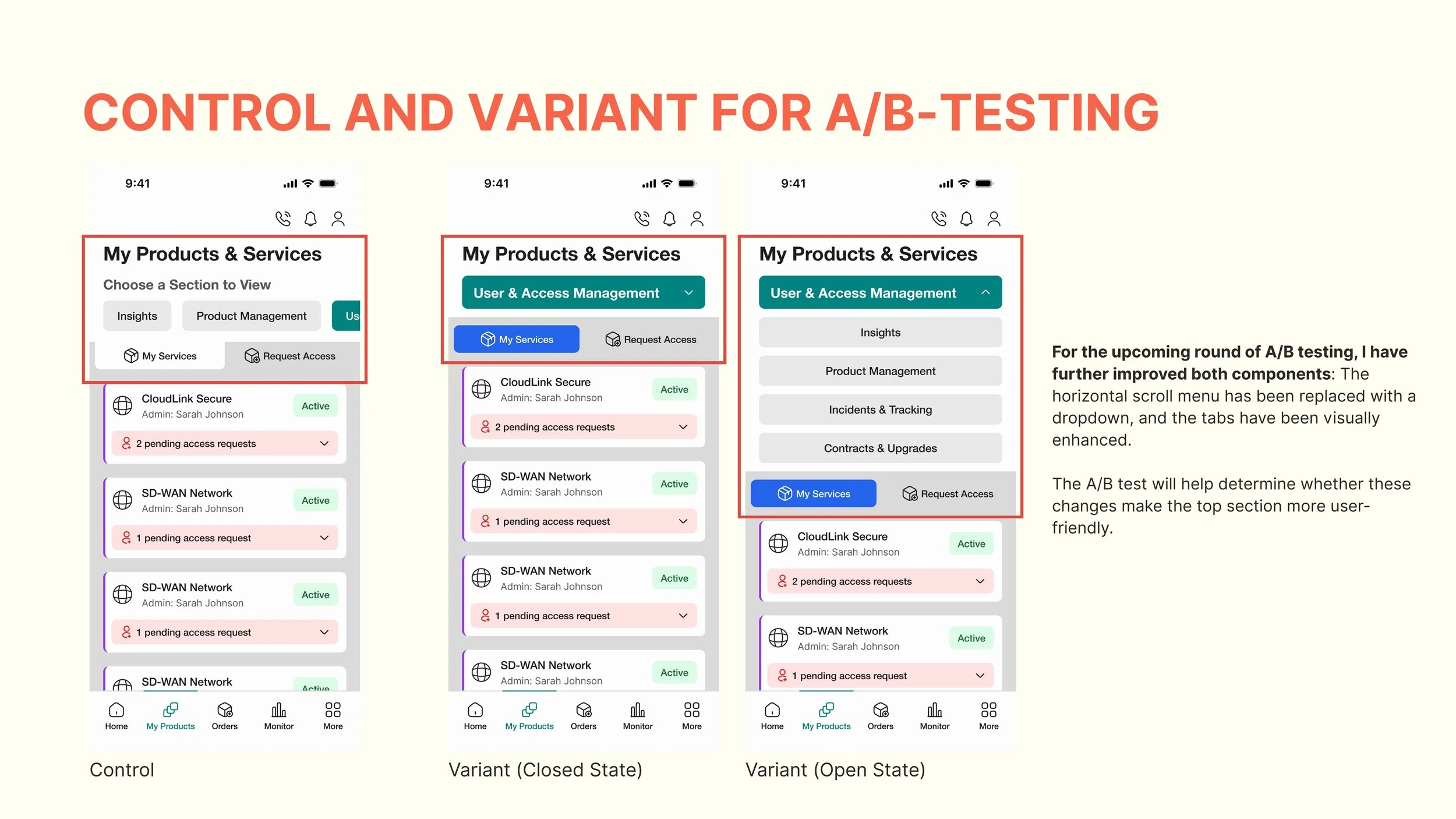
I conducted A/B testing. The top section had received mixed feedback in the first round of user testing, so I created a variant to see if it could be improved further.
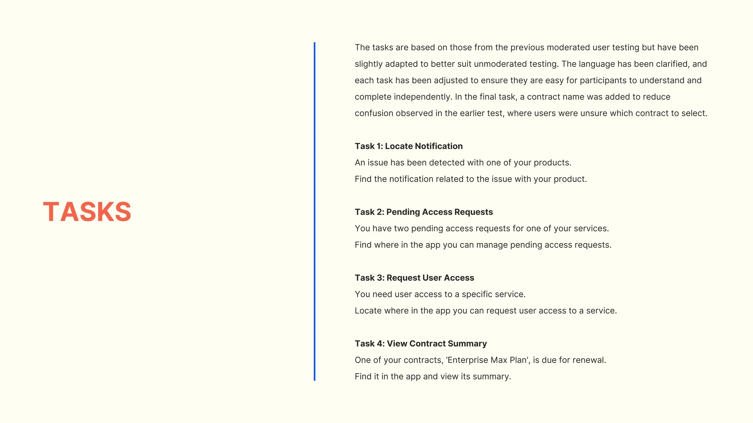
Five participants tested each variant. I used Maze to conduct unmoderated tests, so I ensured the tasks were very clear.
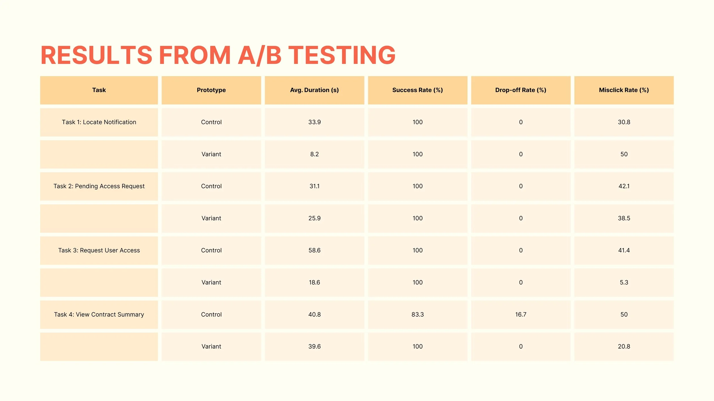
Results from the A/B testing.
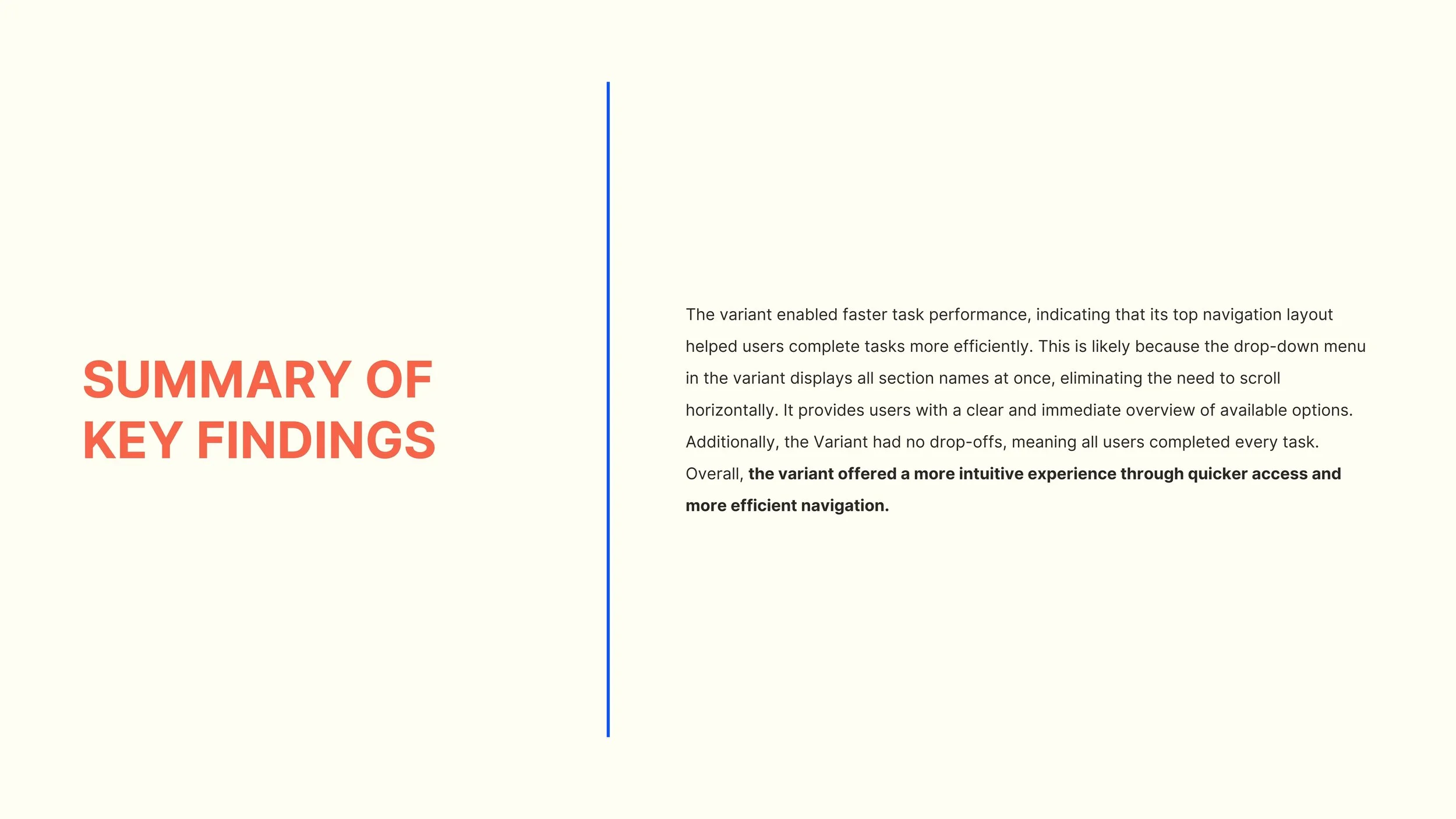
The A/B test compared the control and variant prototypes across four tasks using four usability metrics: Average Duration, Success Rate, Drop-off Rate, and Misclick Rate. The variant achieved a usability score of 58 compared to 44 for the control, offering a more intuitive experience with quicker access and more efficient navigation.
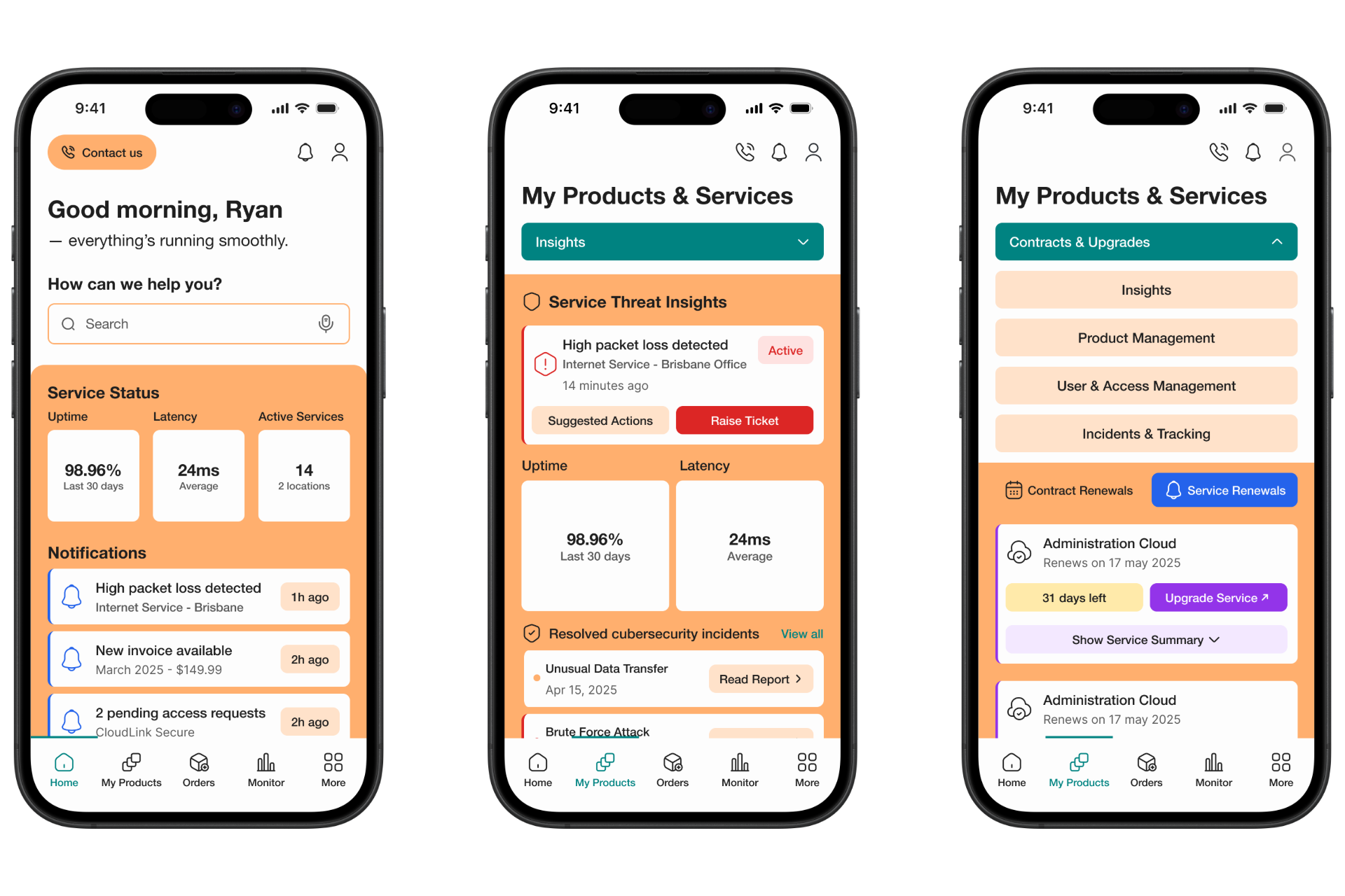
Mockups of the final solution after one two rounds of user testing. The top menu and sub tabs are even more enhanced with colours.
Frames of the final solution. The colour palette is inspired by Telstra’s orange and blue brand colours, reimagined with a softer look.
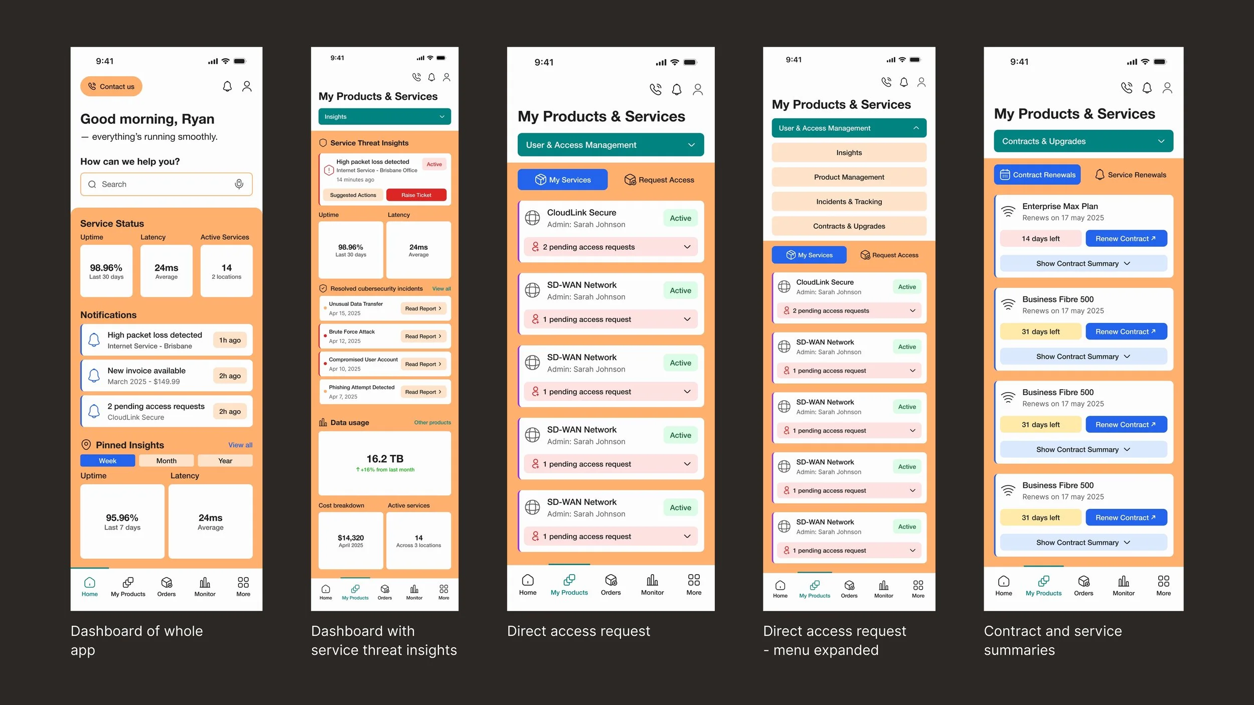
Comparison: Initial vs. final prototype.
Components of the final prototype.
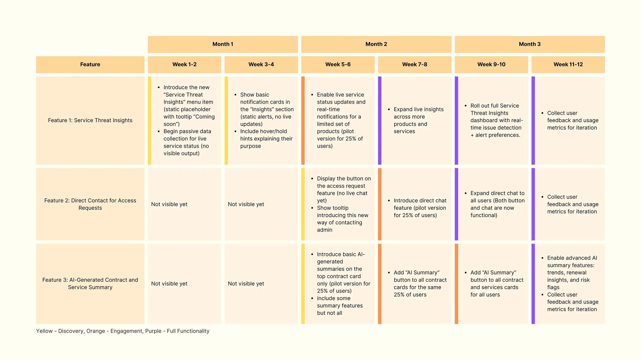
A roadmap illustrating how the new features in the My Products and Services section will be progressively released over three months.